Branding
Holistic Brand Identity & Web Design | Katie Scott Psychotherapy
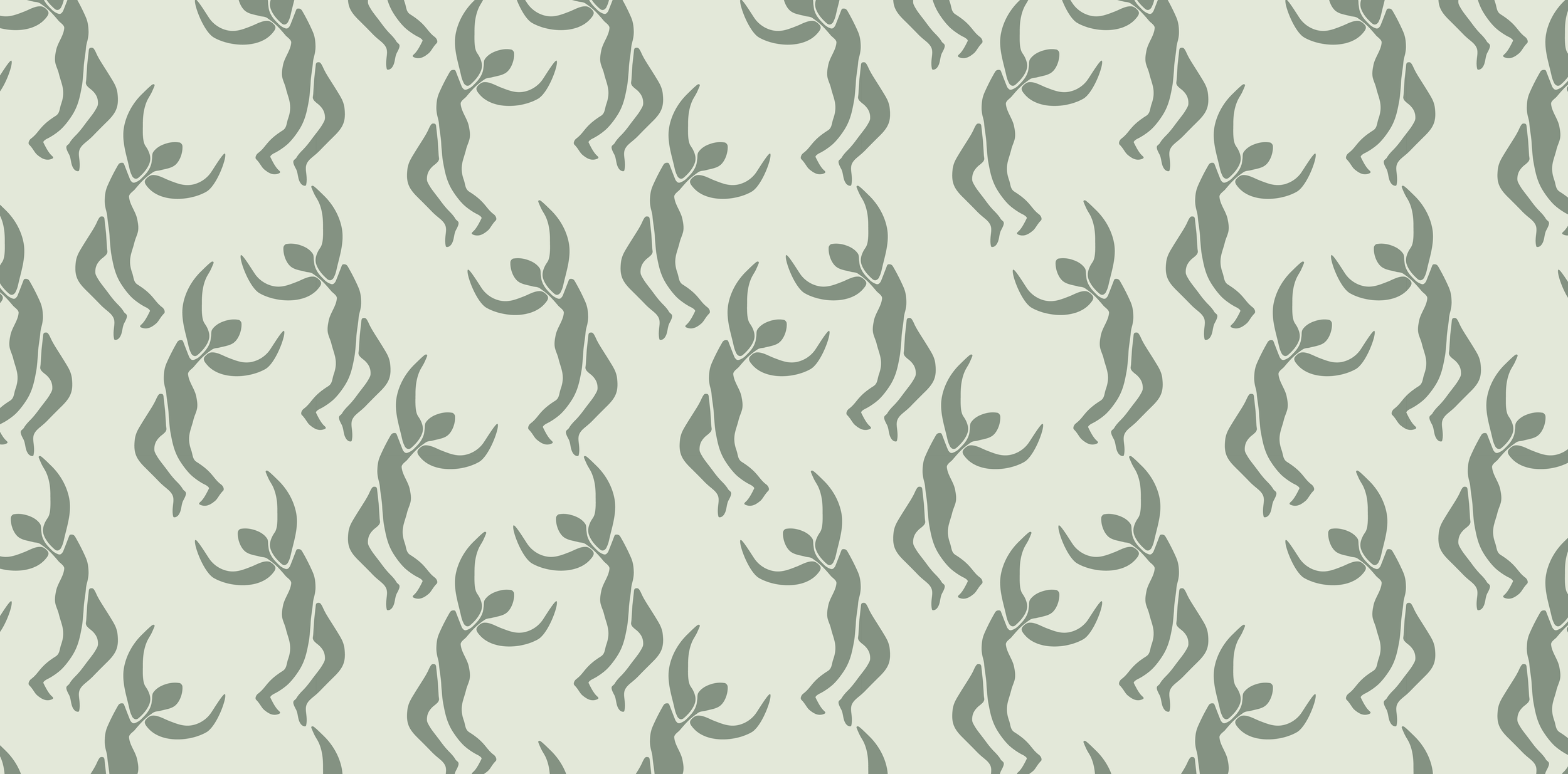
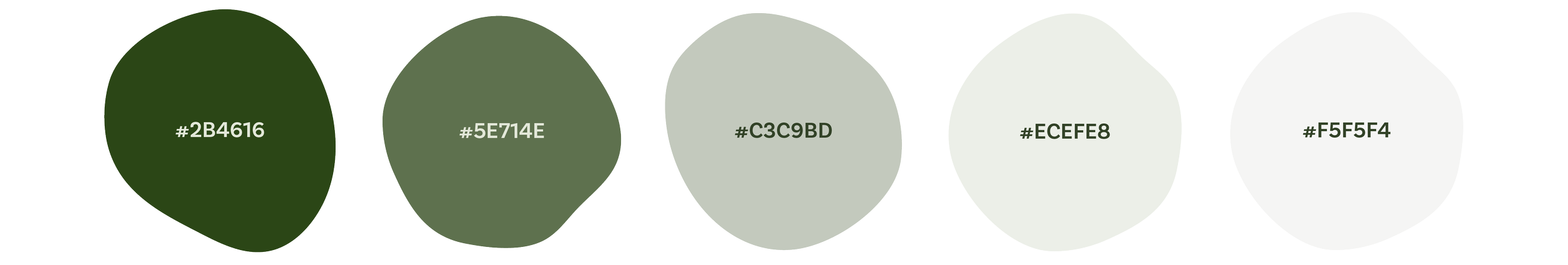
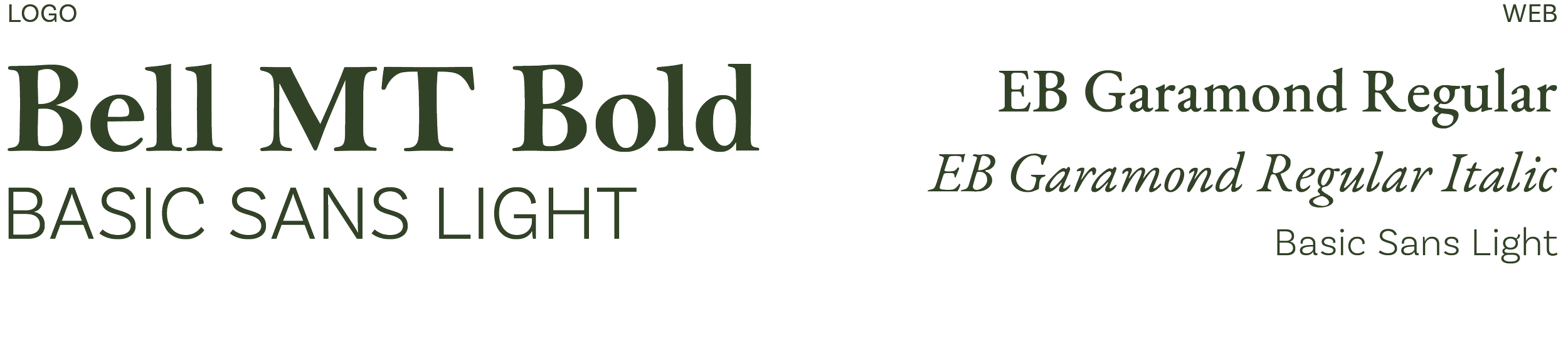
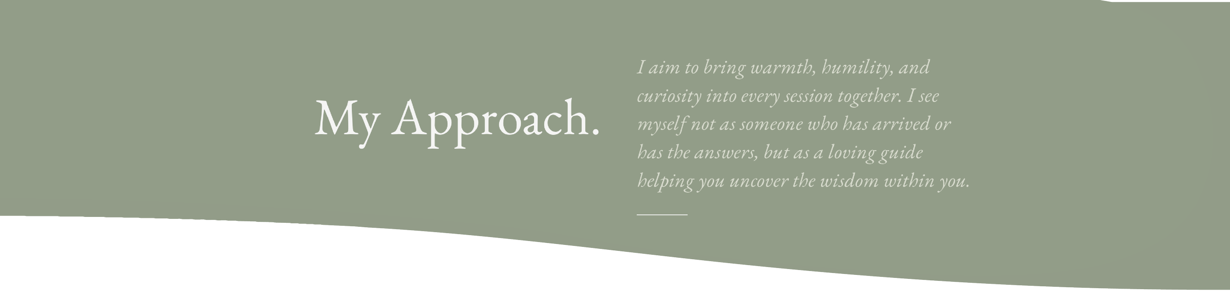
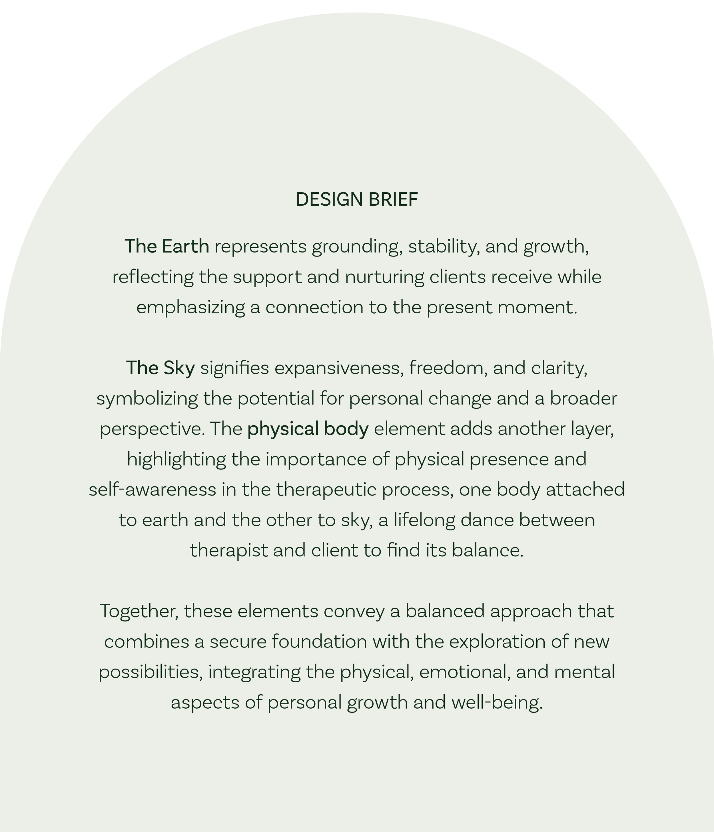
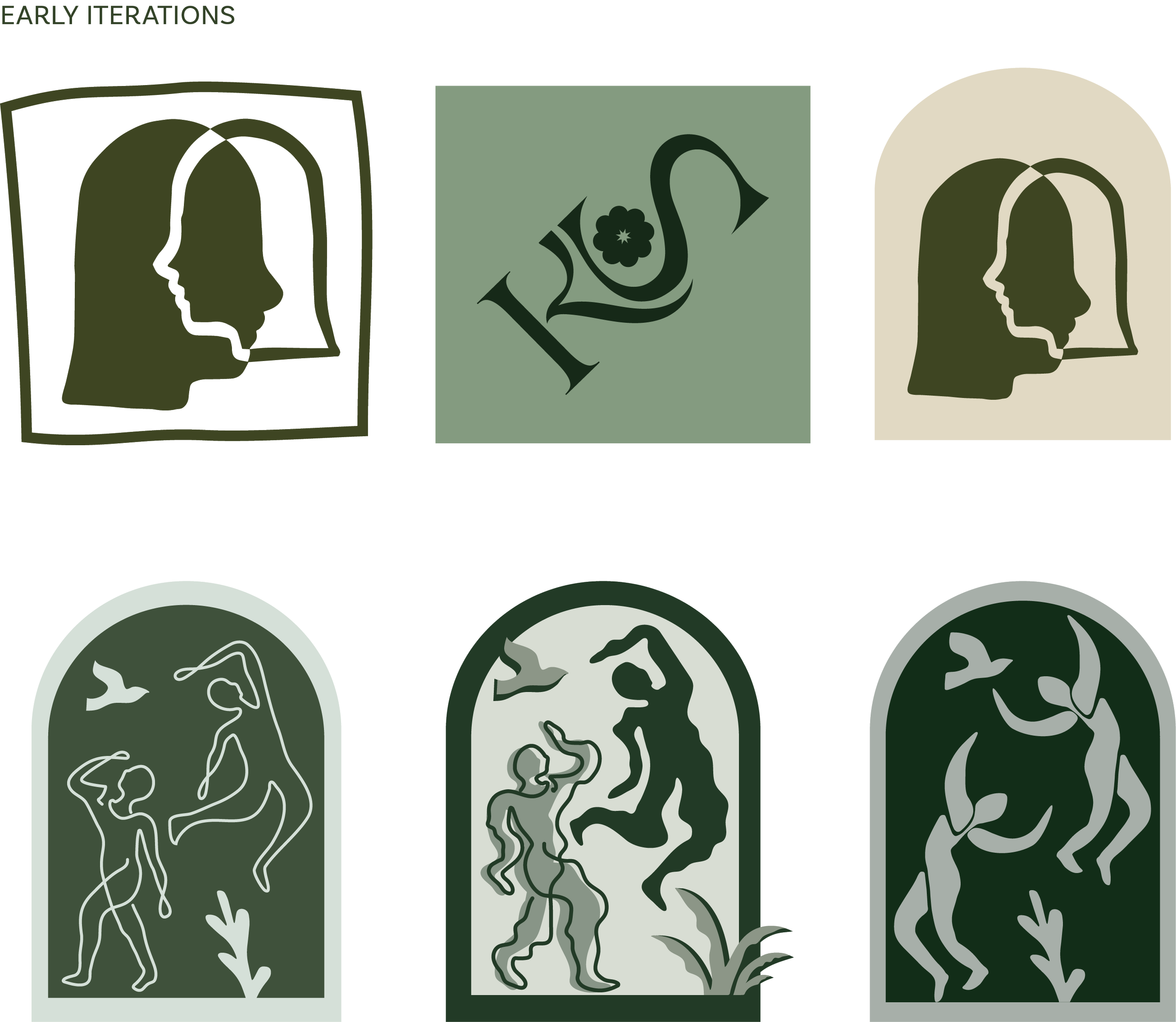
I partnered with Katie Scott to develop a warm, grounded brand identity for her private therapy practice, inspired by the ideas explored in The Body Keeps the Score. Rooted in an understanding of how trauma lives within the body, the brand was designed to reflect Katie’s compassionate, holistic approach to healing. The project included a custom logo, thoughtful typography, and a calming color palette that together create a sense of safety, connection, and trust. Professional photography was also incorporated to bring warmth and authenticity to the visual identity. From there, I designed a custom website with intuitive navigation and a gentle visual structure, creating a cohesive online presence that welcomes clients and supports meaningful first impressions.


Visit the live site here: katiescottpsychotherapy.com

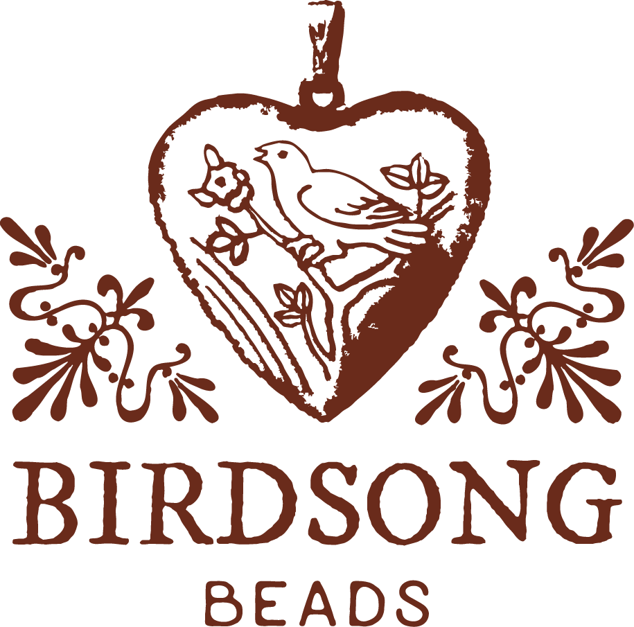
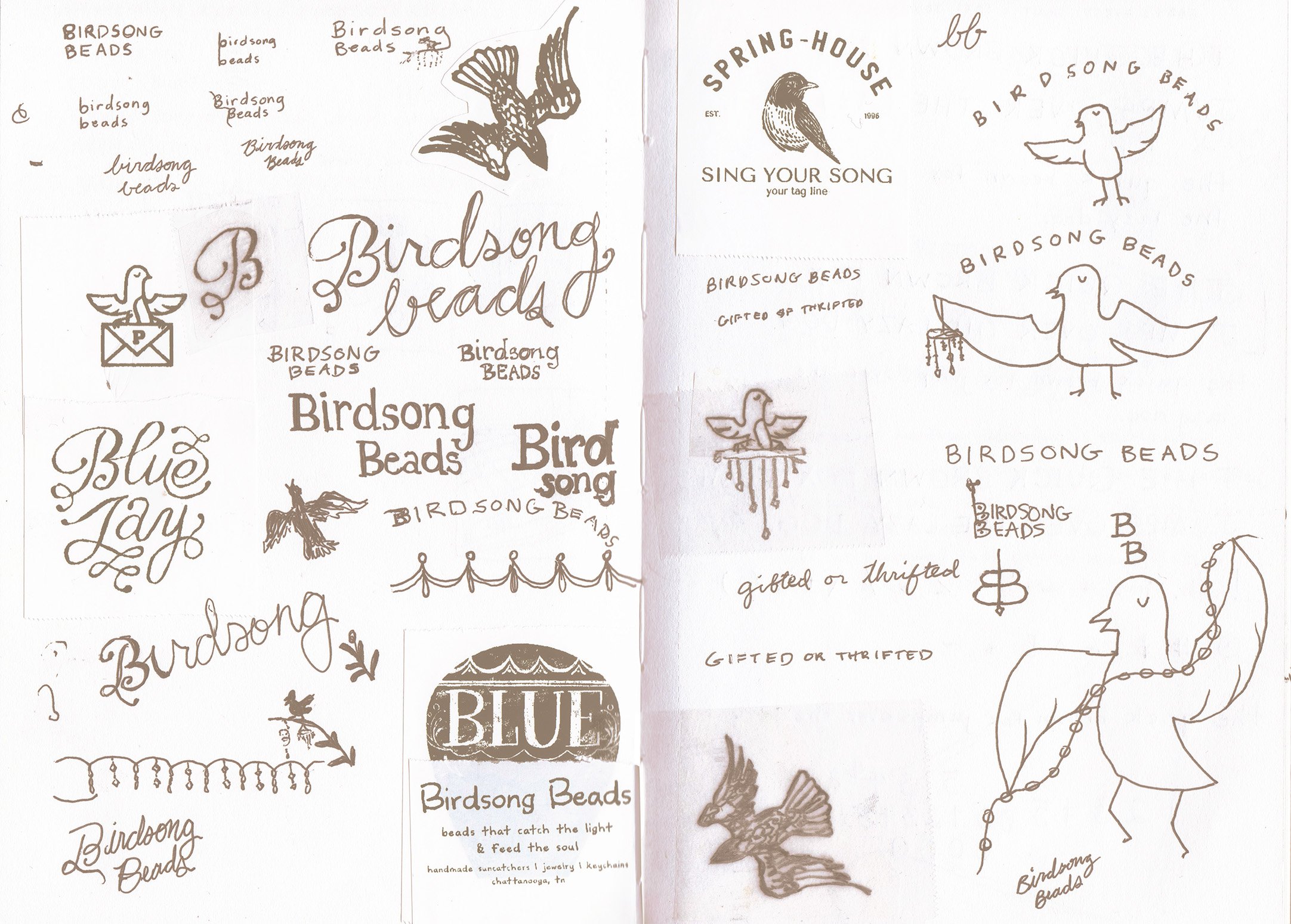
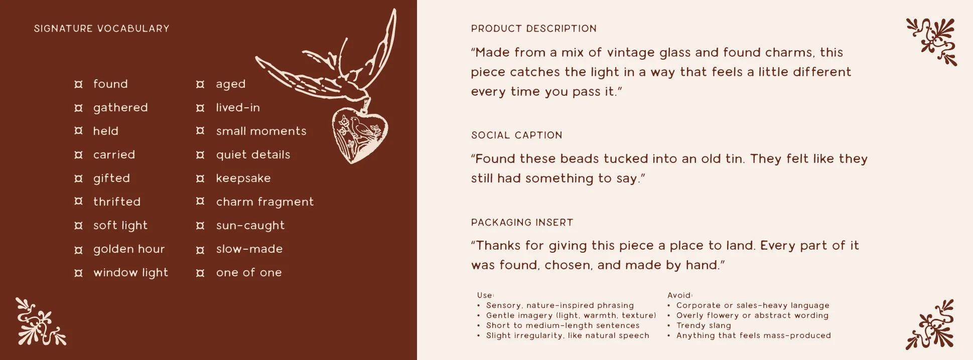
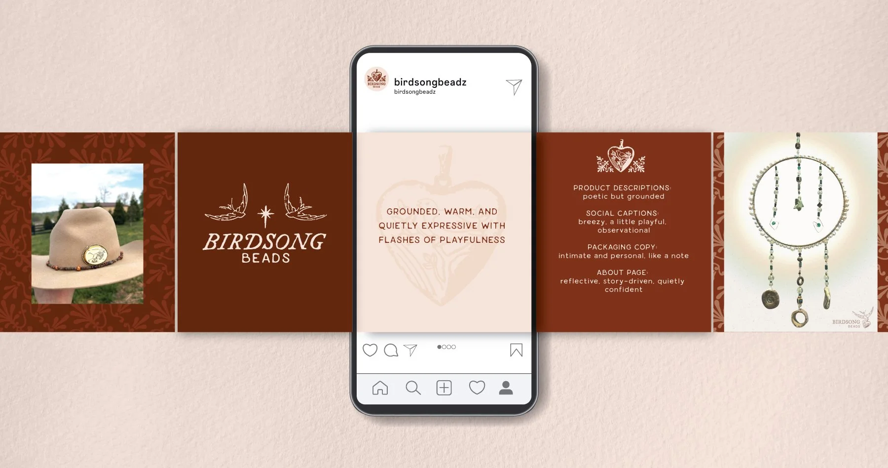
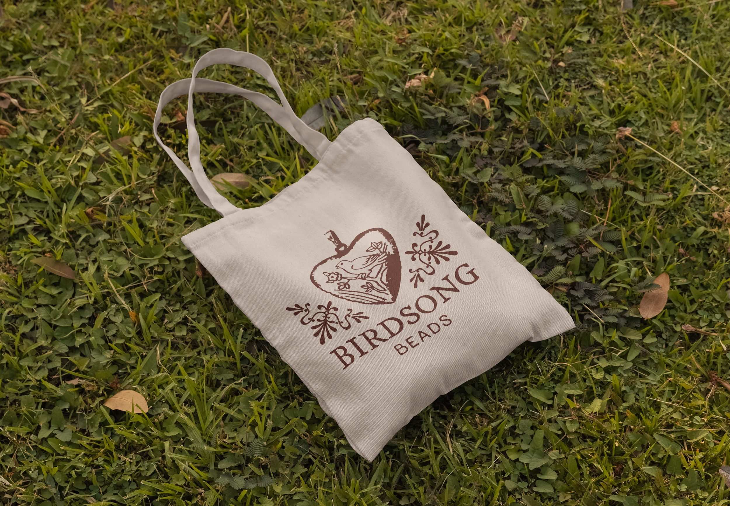
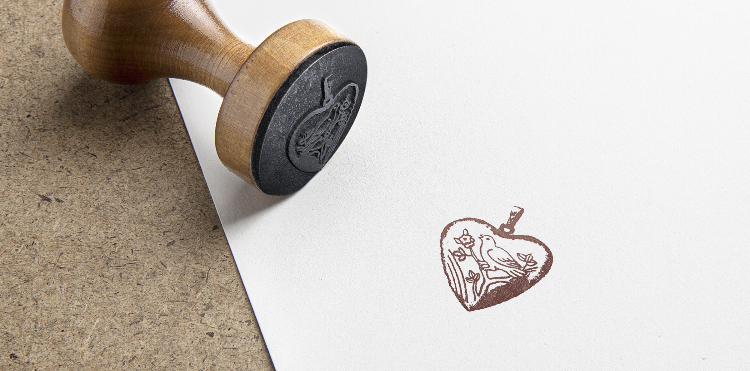
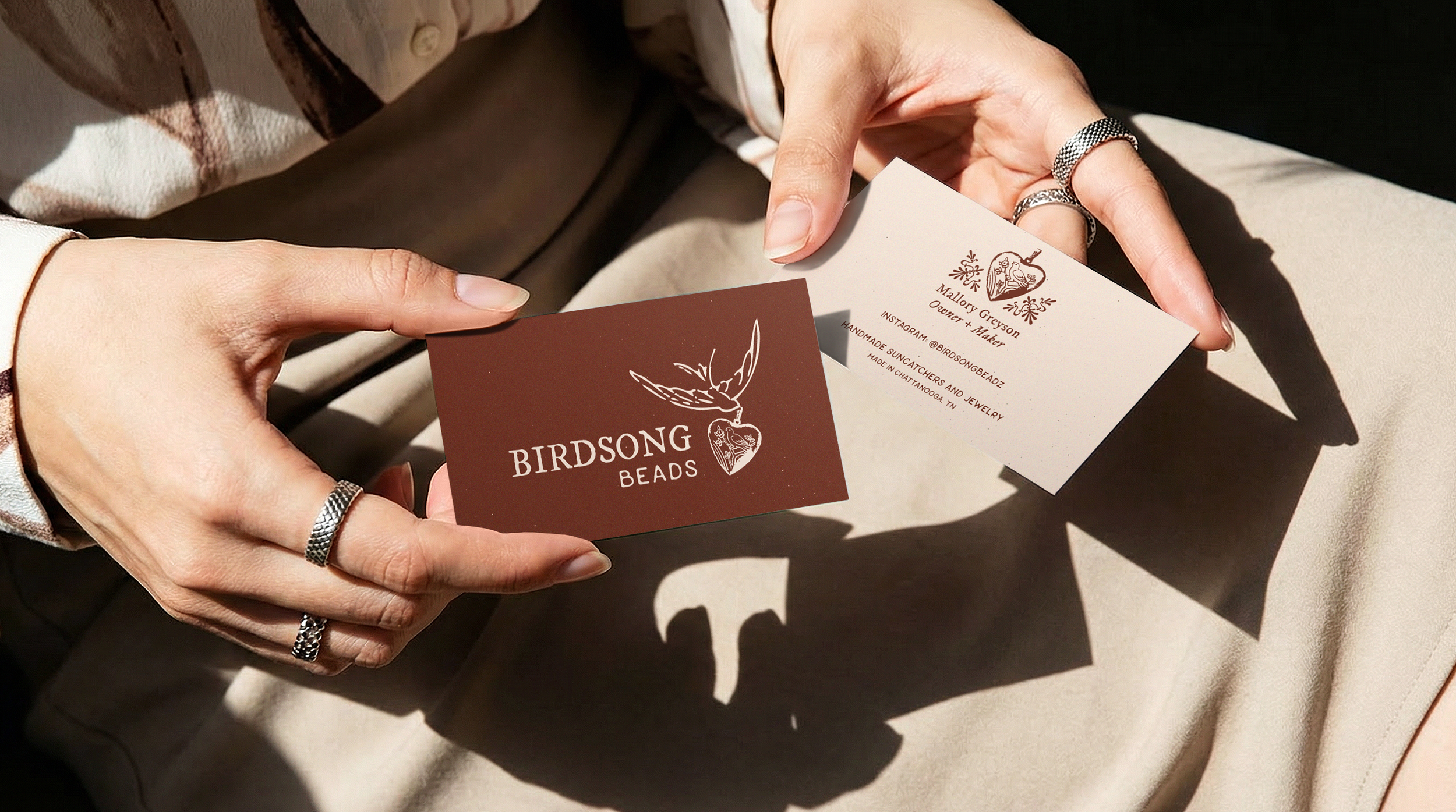
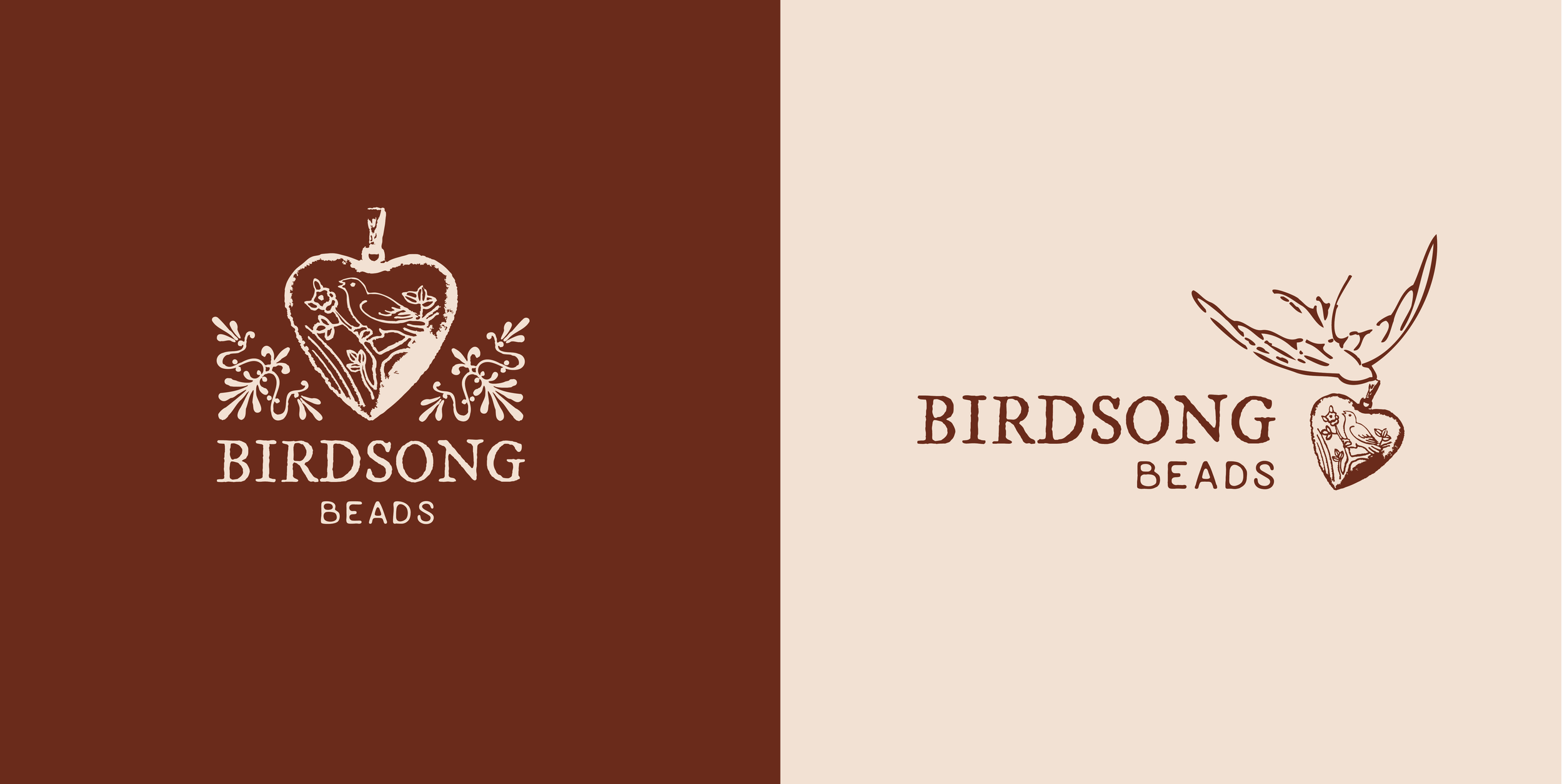
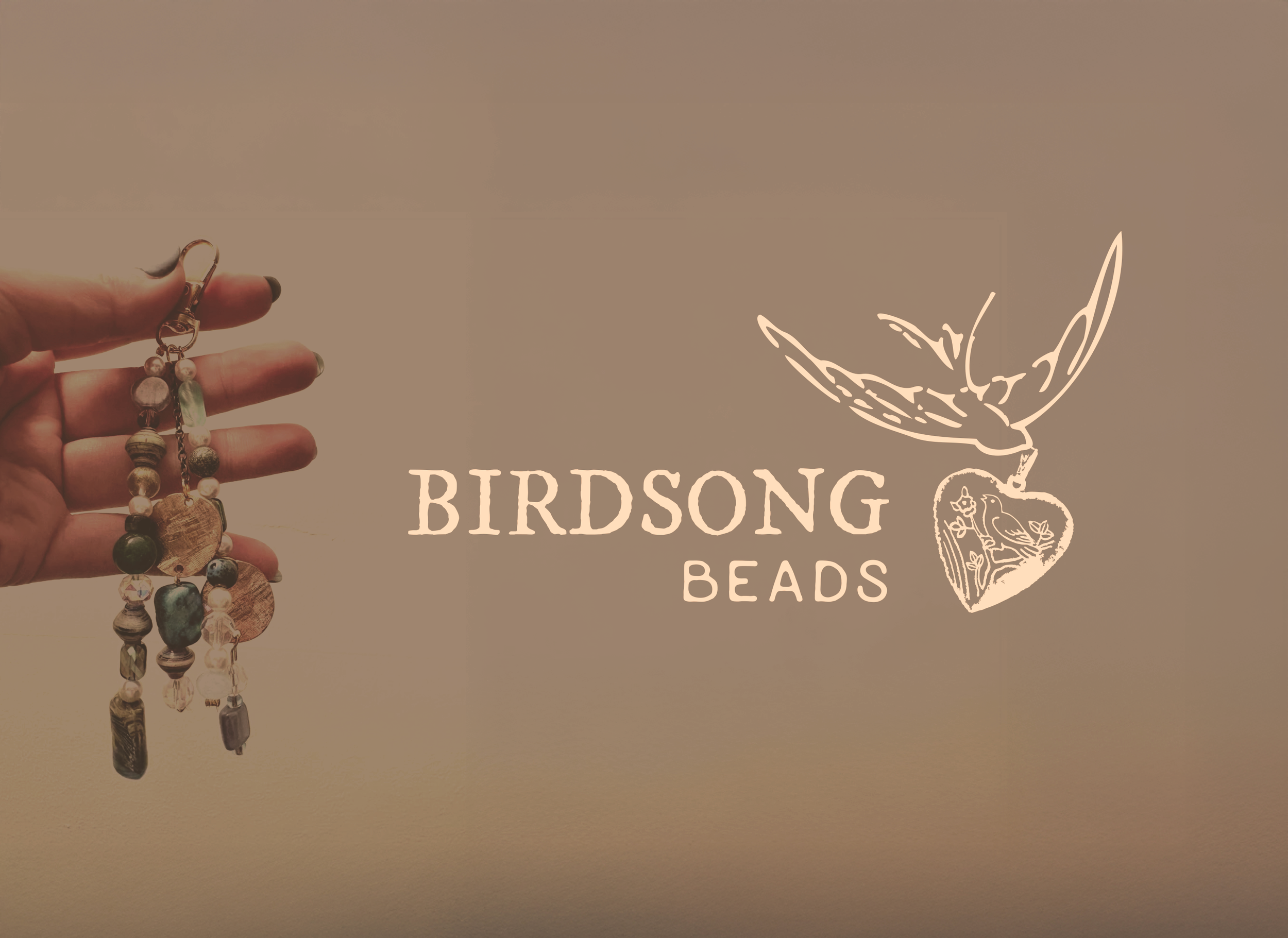
Logo Rebrand | Birdsong Beads
A small business located in Chattanooga was in need of a logo rebrand. They specialize in handcrafted suncatchers and jewelry created from gifted or thrifted materials. The owner wanted their brand to feel more elevated, trustworthy and honest while maintaining the vintage, comforting and earthy vibe.
BEFORE
AFTER

“Jocelyn listened with intention when I explained my rebranding concept, and I felt that she cared about my brand as we discussed solutions. Her communication throughout the design process was thoughtful and consistent. I was blown away by my new logo and branding; her creativity is unmatched. Jocelyn was holistic in her approach, thinking about all sides of marketing to produce new life to my brand.”
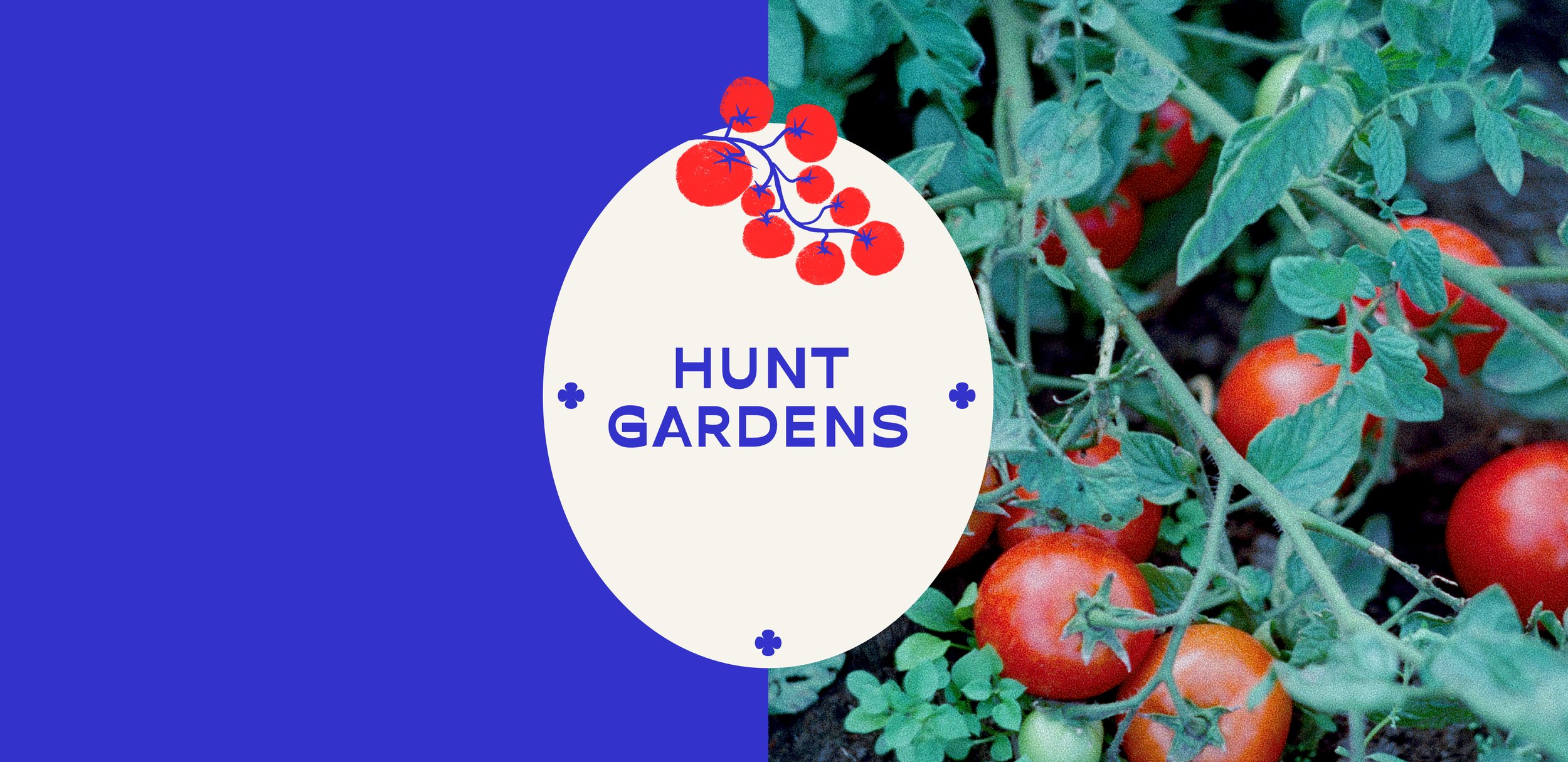
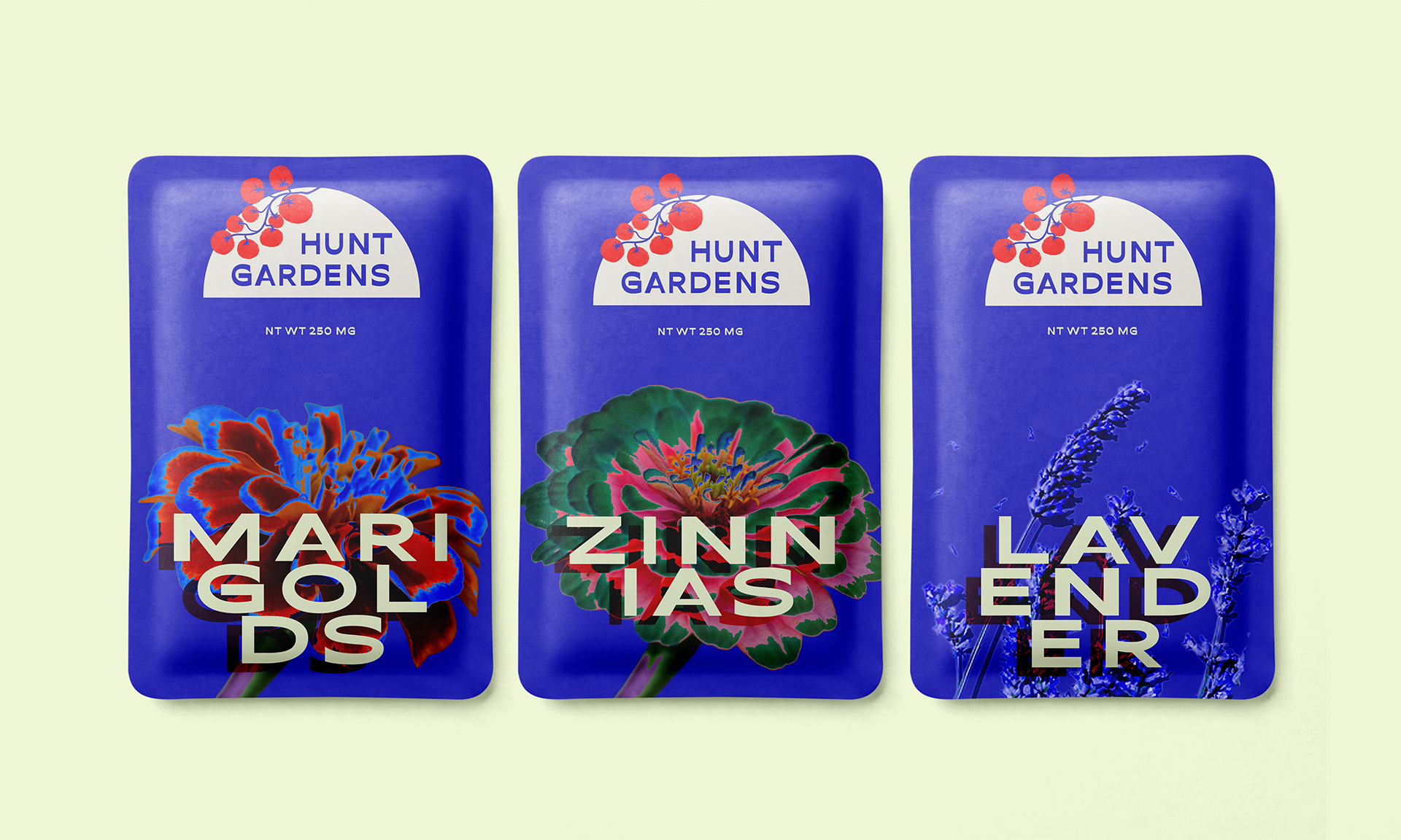
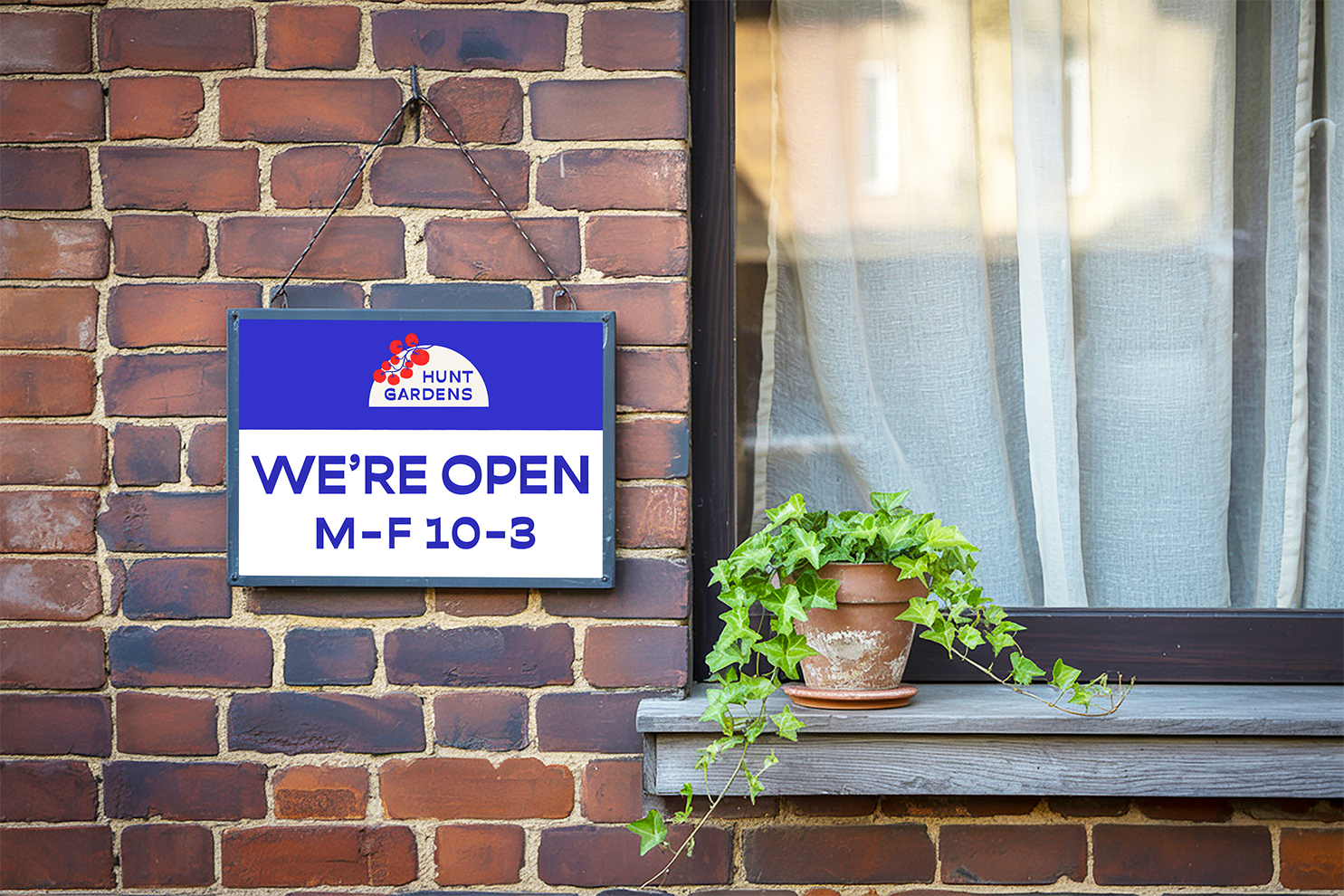
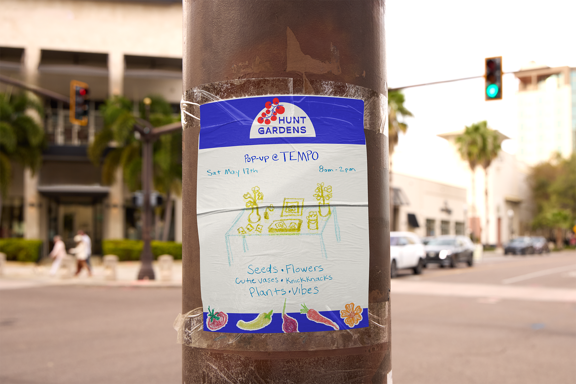
Logo Design | HUNT GARDENS
Local Nashville Farmer requested a logo to encompass all aspects of her business, including the selling of flowers, seeds, and garden vegetables. The client expressed the need for modernity and boldness with a familiar homey feel. The hand-drawn tomato stems (no pun intended) from the vegetable that started it all, and began a bruschetta movement in the Hunt household.